stinger5のページ送りを大きく改善する編集方法
2016/06/28Author:
費用:0円 時間:5分
stinger5のページ下にある、ページ送り。
24.84×24pxと、ちょっと小さすぎる気がします。
なので大きく編集したいと思います。
sponsored link
style.css編集
別に難しいことは何もありません。
以下の部分探して編集しましょう。
.pagination {
 clear: both;
 position: relative;
 font-size: 14px;
 line-height: 13px;
 margin-bottom: 20px;
 padding-top: 20px;
 padding-right: 0;
 padding-bottom: 30px;
 padding-left: 0;
}
.pagination span, .pagination a {
 display: block;
 float: left;
 margin: 2px 2px 2px 0;
 padding: 6px 9px 5px 9px;
 text-decoration: none;
 width: auto;
 color: #fff;
 background-color: #999;
}
以上のコードは同じものが二か所あります。スマホでのメディアクエリとPCでのメディアクエリです。どちらも編集します。
編集するのは、paddingの部分です。以下のコードをコピペしてもおkです。
.pagination {
 clear: both;
 position: relative;
 font-size: 14px;
 line-height: 13px;
 margin-bottom: 20px;
 padding-top: 20px;
 padding-right: 0;
 padding-bottom: 20px; //30から20へ
 padding-left: 0;
}
.pagination span, .pagination a {
 display: block;
 float: left;
 margin: 2px 2px 2px 0;
 padding: 10px 13px 9px 13px; //全体に4足す
 text-decoration: none;
 width: auto;
 color: #fff;
 background-color: #999;
}
サイズを以下のように書き換えましょう。コメントアウトは削除してもらってもおkです。
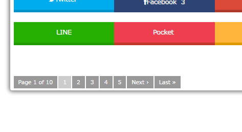
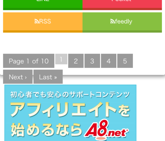
こうすると、以下のようになります。
現在地点のページ位置のページ送りは小さいままですが、それは意図的です。だって、現在ページのページ送りはクリックできないからね。
しかし、これではまだ不十分です。
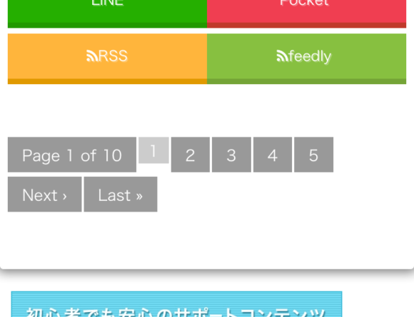
スマホでのページ送りの表示が不自然なのです(;・∀・)
NEXTとLASTが枠の下にはみ出してしまうのは嫌ですね。ということで改善しておきましょう。
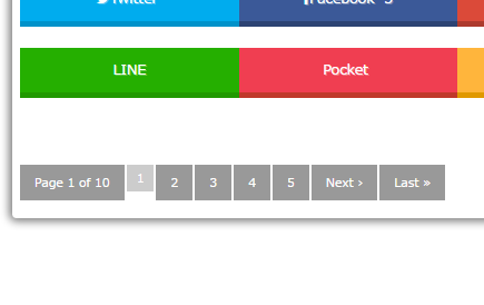
メディアクエリの中にある、.paginationタグを編集し付け加えましょう。
@media only screen and (min-width: 870px) {
~色々コードが書かれている~
.pagination {
 clear: both;
 position: relative;
 font-size: 14px;
 line-height: 13px;
 margin-bottom: 20px;
 padding-top: 20px;
 padding-right: 0;
 padding-bottom: 20px;
 padding-left: 0;
 display: table; //付け加える
}
すると、はみ出さなくなります。
これでおkですね!
ということでページ送りが操作しやすくなりました!
みなさんも編集してみては?